Our brand embodies bold connection. Expressive. Modern. Grounded in equity and justice.
This brand guide is here to serve as a foundation. Think of it as a tool to inspire thoughtful, creative expression that aligns with who we are and where we’re going.
While consistency strengthens recognition, we also value agility and experimentation. You’re encouraged to explore, iterate, and imagine new ways to bring the Mission Telecom brand to life.
Our primary logo pairs our symbol with a custom wordmark, creating a versatile mark used across a wide range of materials—from external communications to letterhead and website headers.
Whichever version you choose, always ensure it’s easy to read. Use light logo colors on dark backgrounds and dark colors on light backgrounds for maximum clarity.
We offer full-color logo versions designed for both light and dark backgrounds. These are commonly used across our own platforms, such as our website.
One Color Versions
At times our logo may need to be presented in a single color—an ideal choice for busy layouts where clarity and impact matter most.
Icon
Our icon can stand on its own and doesn’t always need to appear with the wordmark. You’ll see it in all the usual spots—social avatars, favicons, and anywhere the full logo lockup doesn’t quite work.
We also use the icon as a visual design element, featured in layouts independently from the wordmark.
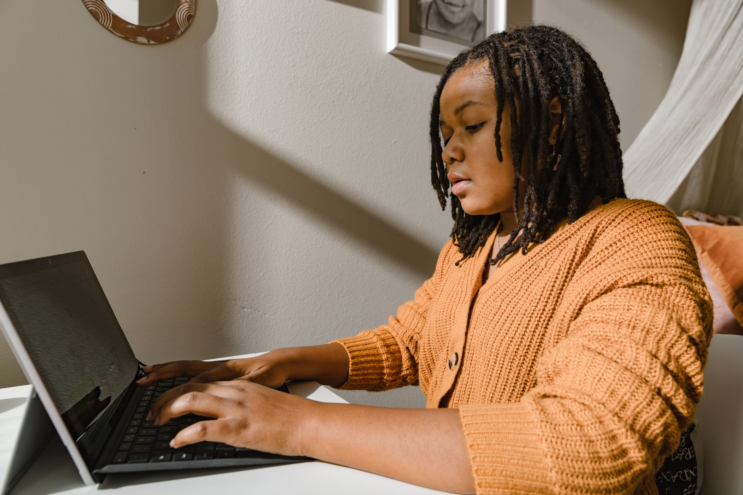
Our visual style blends a modern documentary feel with strong contrast and warm, natural light. Images should be candid and authentic, featuring real people in real environments—not overly staged or polished.
Modern Documentary
Images should feel candid and authentic—real people in real environments (schools, studios, collaborative spaces). Avoid staged or overly polished setups.
Crushed Blacks & Natural Warmth
Images should feel candid and authentic—real people in real environments (schools, studios, collaborative spaces). Avoid staged or overly polished setups.
Color
Use neutral or muted environments with intentional pops of saturated color. Avoid bright, artificial palettes.
Tone
Our tone is relatable, confident, and inclusive. We show people actively engaged, whether thinking, creating, or connecting, with body language that conveys purpose and energy.
Relatable & Honest
Capture everyday moments—working, learning, thinking. Images should feel like a window into real life.
Confident & Engaged
Show people in motion or thought, interacting with tech or one another. Avoid passive body language.
Inclusive & Diverse
Representation across age, race, gender, and ability is essential. Groups should feel naturally diverse, not staged.
Subjects & Environments
Our tone is relatable, confident, and inclusive. We show people actively engaged, whether thinking, creating, or connecting, with body language that conveys purpose and energy.
Editorial-style imagery
Focus on individuals and small groups engaged in meaningful, real-world activity.
Natural interaction
Prioritize moments of connection—between people, with tools, and within their environment.
Authentic settings
Use schools, learning spaces, and community hubs with contextual details that convey purpose and personality, such as whiteboards, laptops, books, or art.
Editing & Stock Photo Guidelines
For standardization, it’s best to have a visual reference than specific technical specs, but the following guidance should be taken into consideration.
When editing photos, they should include:
Crushed blacks for richer contrast
Natural warmth with a white balance between 5200K–5800K
Avoid harsh filters, strong vignettes, or high saturation
Skin tones should look natural and warm—not orange or cool
Favor natural or ambient light (avoid harsh overhead lighting or flash)
For stock photography:
Select only images that align with this visual guide
Must feel candid, modern, and grounded in real environments
Should reflect natural lighting, authentic moments, and inclusive representation
Edit stock images as needed with color grading to match brand tone
Use a Reference Library: An approved Reference Library should be used before starting any shoot or selecting stock
Do:
Frame with leading lines and foreground elements when possible
Capture connection and movement, not static poses
Use light that’s directional but soft—no harsh flash
Don’t:
Feature isolated subjects with no environmental context
Use flat, overly lit scenes or cold tones
Stage people into artificial groupings or gestures
Textures & Scribbles
Backgrounds
These expressive textures are designed to be used as backgrounds in layouts—adding visual depth and character without overpowering your content. Ideal for creating contrast that keeps text legible while preserving the story in your content.
These hand-drawn scribbles and organic marks bring energy and personality to designs. Use them as accents to highlight key elements, introduce movement, or inject a sense of handcrafted authenticity into digital compositions.